B2B
Indoor map editor tool
TYPE
UX-UI Design
YEAR
2022
ROLE
COMPANY
HyperIn
UX Designer

Customer service involvement was necessary to manage map tasks on behalf of users, causing extra cost and inefficiencies. The tool was complex, not self explanatory and not easy to use.
▪️ Team
Product manager
UX Designer (me)
Developers
Map developer domain expert
▪️ Context
The Indoor Mapping Editor is where a Shopping center configures and maintains their store locations, facilities and routes so that all this information displays correctly on the websites, digital signages (kiosk) and mobile apps floor maps.
▪️ Problem
End of life of Silverlight and IE11
The original map editor was retired due to the end of life for Silverlight and IE11.
Extra cost and inefficiencies:
Customer service involvement was necessary to manage map tasks on behalf of users, causing extra cost and inefficiencies.
Not user friendly:
The tool was complex, not self explanatory and not easy to use.
▪️ Outcome
Brand new mapping tool offers a smoth experience for admin users to autonomously and efficiently manage stores, services, and routing locations on the map.
Facilitate effortless and efficient map management
Help user feel confident by providing complete control for navigation throughout the map
Ensure ease of use and memorability to facilitate learning
▪️ My role
Led the end-to-end process including discovery, ideation, iteration, and supporting developers with implementation.
Uncover insights and translate concepts into the new redesign to gain alignment and drive decision making.
Defining information architecture and user flows
Interaction, Visual design, Prototyping

▪️ Discovery
Understanding current state, pain points through costumer service and feature audits
To uncover the pain points I audited the feature and collected feedback through the Customer Service team since they were responsible on managing the maps. Here’s what I discovered:
▪️ What I did
Feature audit
I evaluated the feature by uncover usability issues and flows problems
Costumer service agents feedback
I talked with costumer service team to deeply understand workflows, use cases and discover pain-points.

Example of the original maps editor view when adding services on the map.

In this other example, the user define the service properties. Left bar contains map interaction and draw tool. Right panel contains, map navigation, map visibility, edit and zoom properties.
Key insights
Map focus allows the user to visualise changes and interact with it.
Drag elements on the map makes the task easy
Layer visualisation is great. It helps to place the nodes and fix overlaps.
▪️ Work well
▪️ Not work well
People need to be trained in order to use the map. The setup process can be confusing and is easy to make mistakes.
Not well integrated flows and navigation. No sense of completion and not consistent with the Admin Portal patterns.
Not clear instructions on how to manage routes. A lot of guessing and exploring before commits can potentially be frustrated
Interactions with the map and tool panel feels unfamiliar.
▪️ Ideation
Conceptualising the new experience
I designed a task-oriented workflows that guide users to complete each task efficiently with clear instructions and sense of completion.
▪️ What I did
Explore flows
I did low-fi designs to quickly explore different alternatives and find the best solution for users.
▪️ How I did it
Facilitations
Conducted facilitation and kickoffs with PM, developers and the domain expert involved in the project to iterate flows and identify feasibilities.
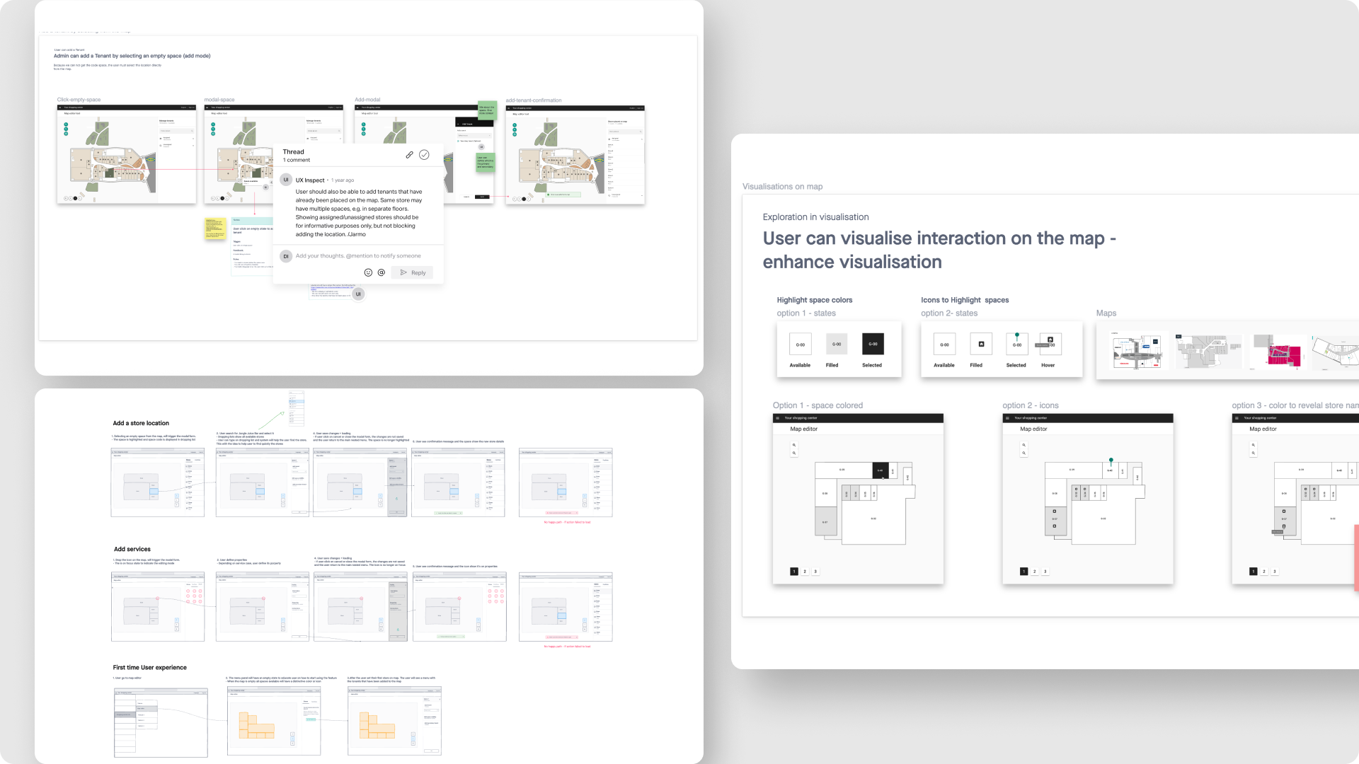
Workshops and sessions I facilitated
Task oriented workflow

With the structure in mind, I started wire-framing a solution that reduce cognitive load between the navigation, the configuration properties and the direct manipulation with the map (zooming, panning, floors).
The main user actions can be found under the tab bar so it make it easy for the user to navigate

Split screen with list form allows users the ability to view and search through all of the indoor store locations and services available in their indoor map. This influenced the decision to add a list forms and modal views to give context when editing.

▪️ Testing and validation
Solving workflow gaps
During this phase, we came across certain limitations and challenges in redefining the map tool structure. We needed to be backwards compatible with the current 25 maps that were in production, so in order to continue support them, we needed to include the routing.
▪️ What I did
Internal testing
During internal testing I noticed that our Admin users would need to complete their task in different flows, leaving room from confusions or frustration.
At this point we couldn’t test our assumptions with real users. So I tried to found a simple solution that balance our technical constrains and our user needs.
▪️ Who I did it
Prototypes
I created multiple prototypes in Figma to help validate the assumptions.
Re-iterating the Map workflow
I kicked off a meeting to evaluate the new workflow and address technical feasibilities

“Close collaboration with developers was key to define all map interactions”
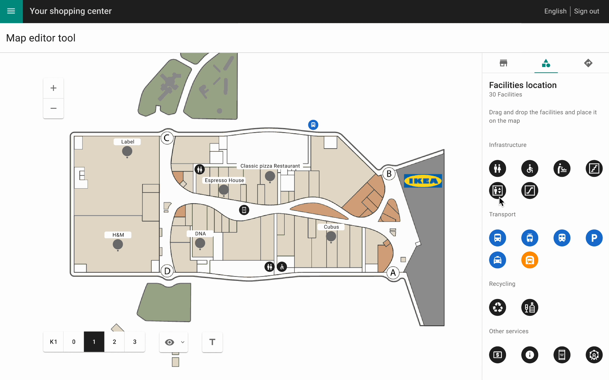
▪️ Solution
Final designs
Location management
The stores are displayed in a scrollable list where Admins can quickly find the tenants, or quickly select them from the map.

Adding facilities become easy
The services are shown in a scrollable list where the user can quickly find and drag any icon to the map. The list is grouped by category type, which makes easy to identify them.
The modal view gives context when editing.
Routing instructions are more readable
Directions are now easy to follow and are much more readable. The original design did not have any instructions on how to edit, add or delete the routing.

Layers visibility provide context
During discovery phase, I found that the visibility in the original design was something that users found really useful, so we decided to keep it. The different layers could toggled on and off, to gave our users a freedom of managing the map and have better sense of where to place the nodes when creating routes.


From big picture to details
Communicating map controls and iterations in a more intuitive way was something I put extra effort. I created cohesive UI patterns that help users interact with the map confidently.

Examples of the variety of maps in production.